Paula’s Choice
2026 Brand Evolution
The Paula’s Choice rebrand marks a shift from overwhelm, contradiction, and noise to a brand built on clarity, guidance, and confident choice.
While always rooted in truth and science, the brand had become fragmented, overly functional, and lacking a clear emotional center. This evolution reclaims its journalistic heritage, sharpens scientific authority, and repositions Paula’s Choice from educator to trusted guide—the place consumers turn for proof, not promises.
At its core is a simple idea: move from confusion to clarity. Reduce cognitive load, simplify decisions, and make benefits instantly recognizable.
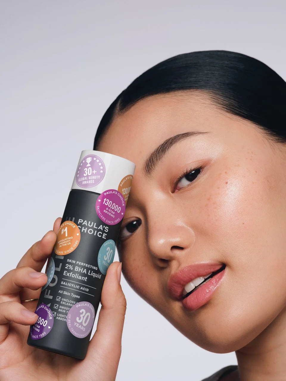
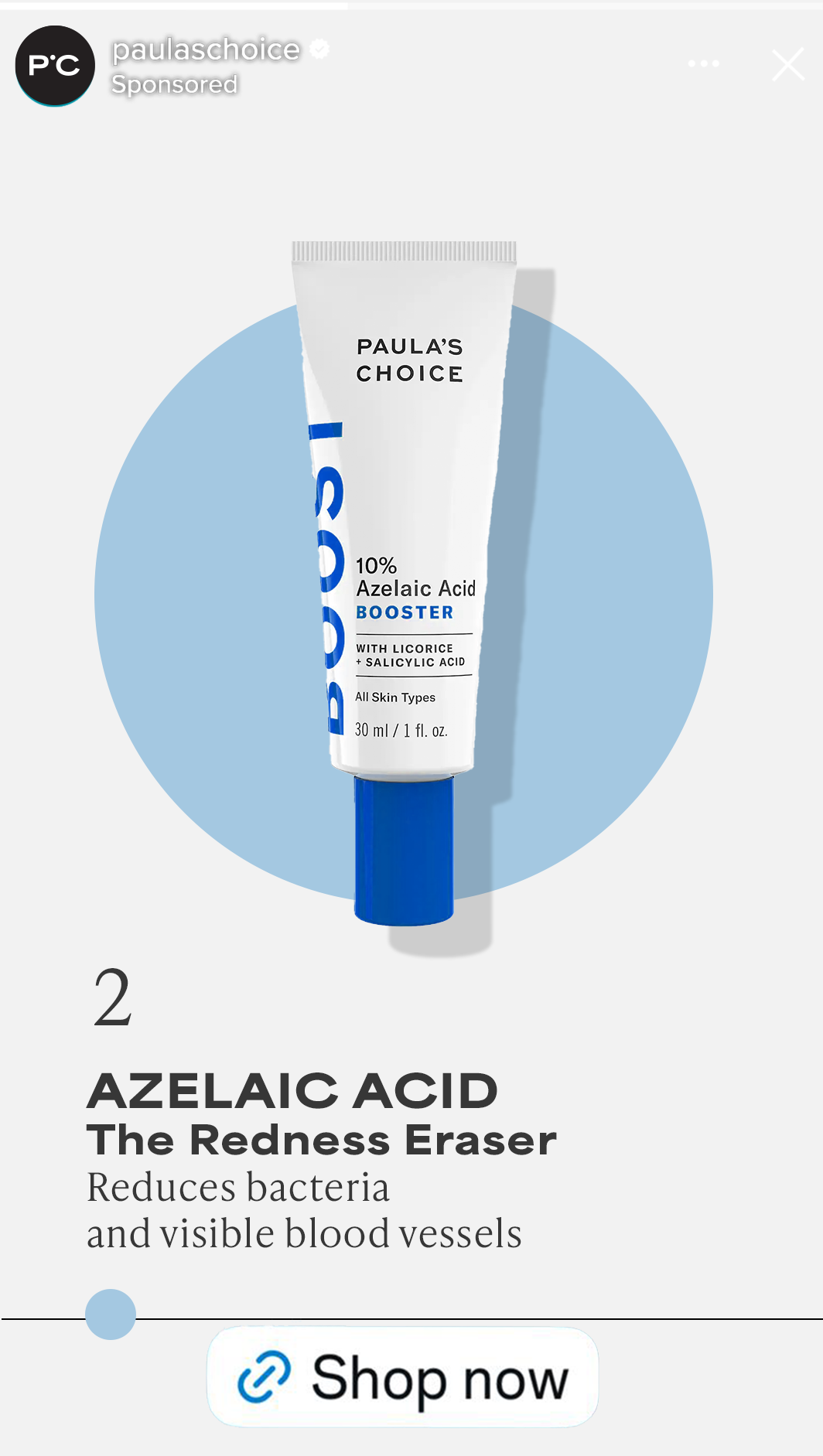
This comes to life through a more direct, editorial tone of voice, a system of intuitive color and circular cues, visual metaphors that communicate benefit at a glance, elevated human-centered photography, and a design language built for consistency and recall.
The result is bold, human, and unmistakably clear in a category defined by noise.
Role
Concept + Creative Direction
Cross‑team alignment (design, content, product, retail, marketing)
End‑to‑end production oversight
Cross‑agency + internal integration
Photographer: Jenn Collins
DP: Kat Borchart
The logo was refined to express clarity, confidence, and credibility—reflecting a commitment to science-backed results.
The uppercase logotype conveys precision and authority through a clean, controlled form. The dot, replacing the apostrophe, becomes a purposeful symbol of guidance—representing the brand’s role in leading people to their best skin.

Skin-first. Product-forward. Science made visible.
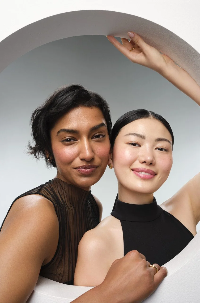
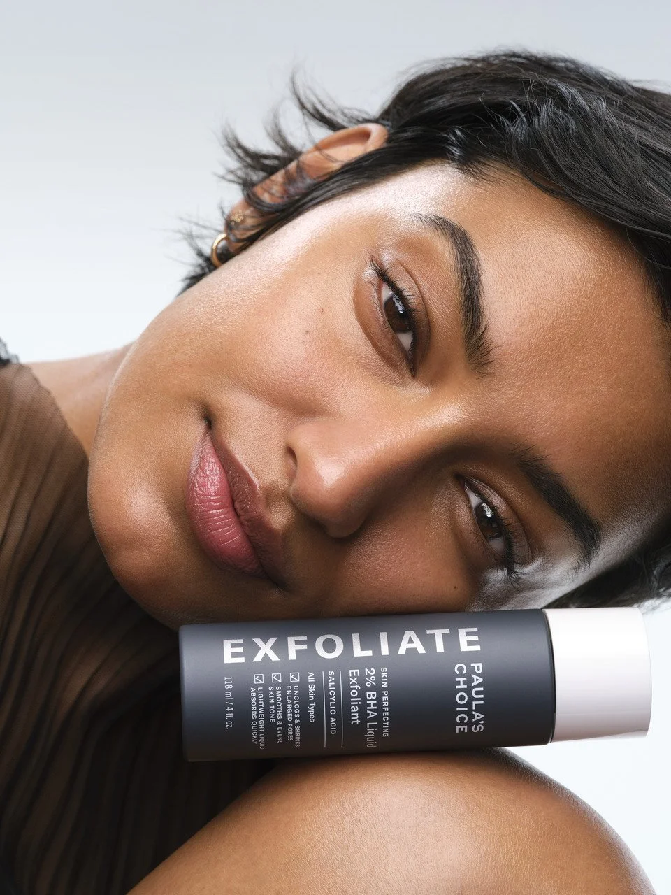
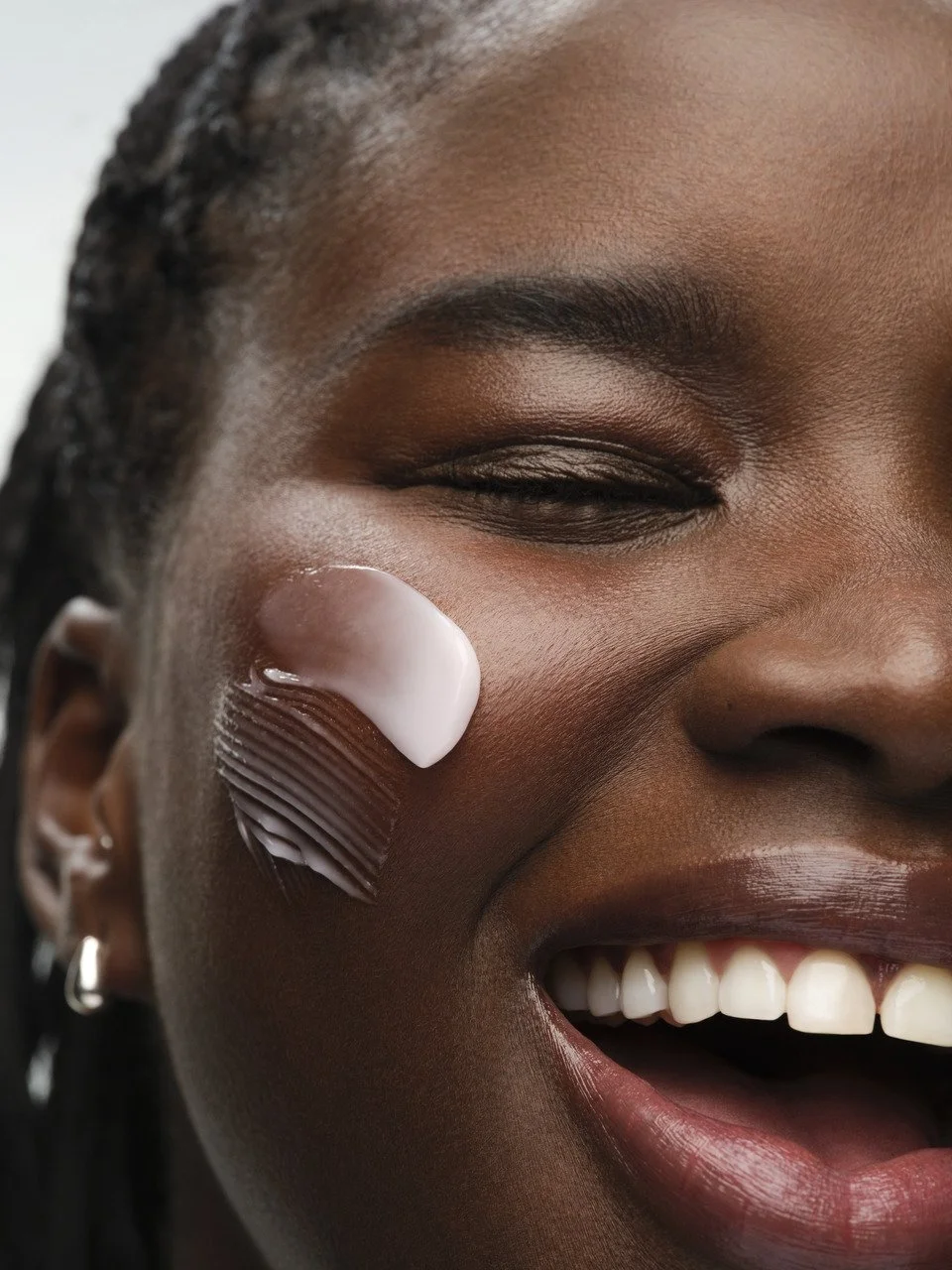
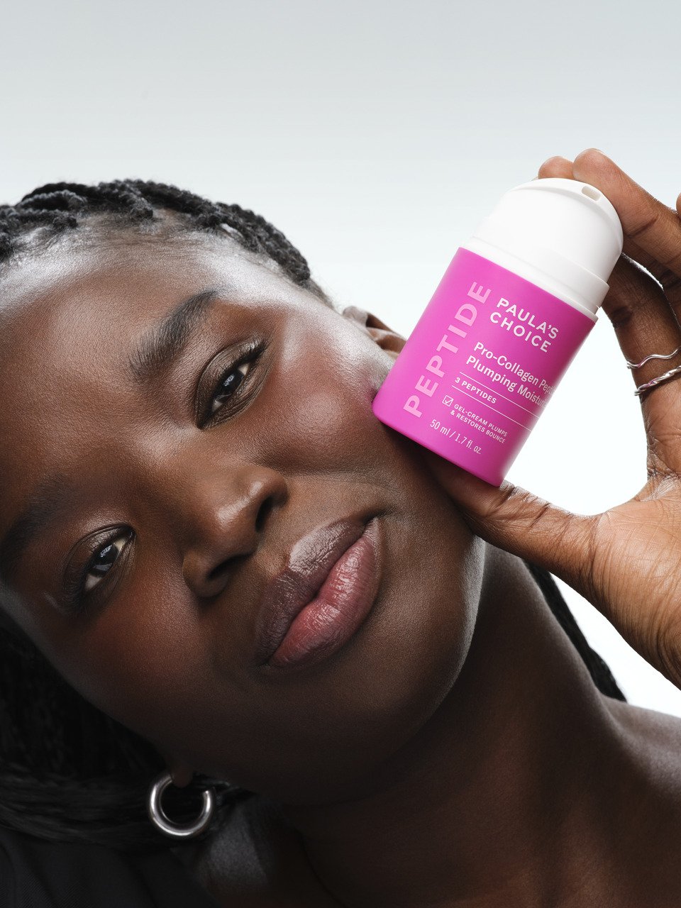
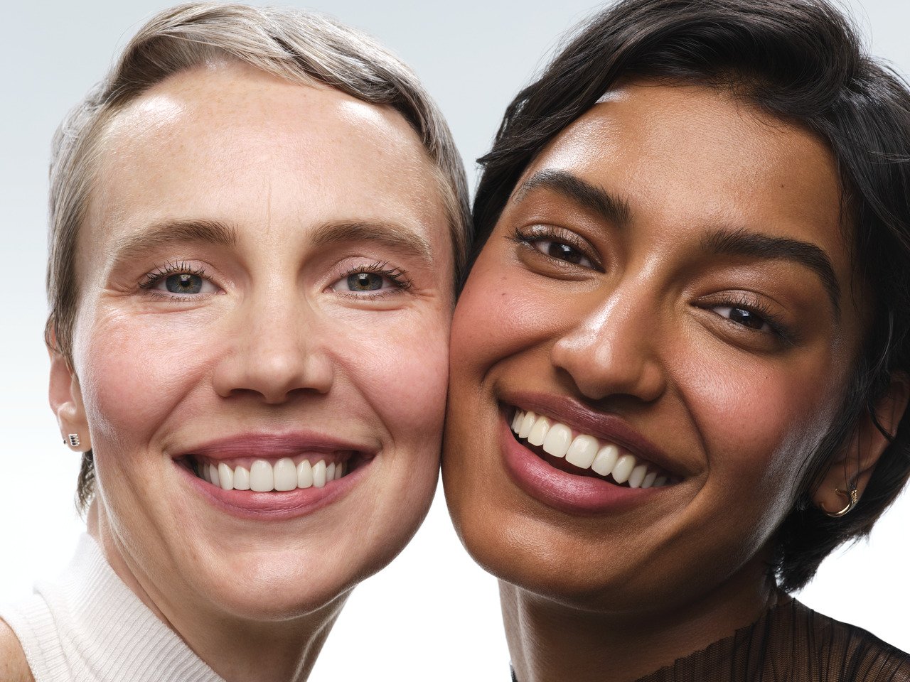
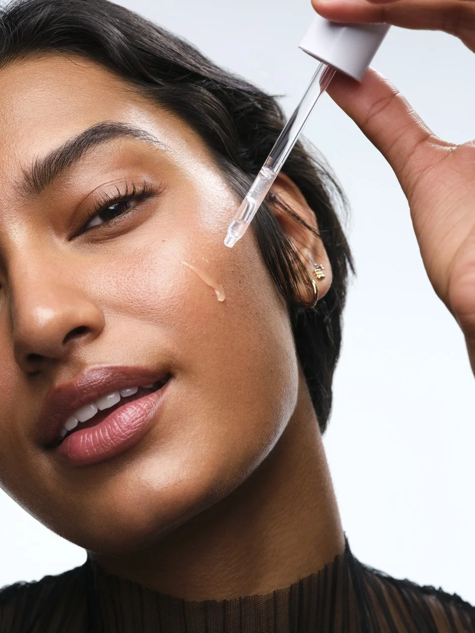
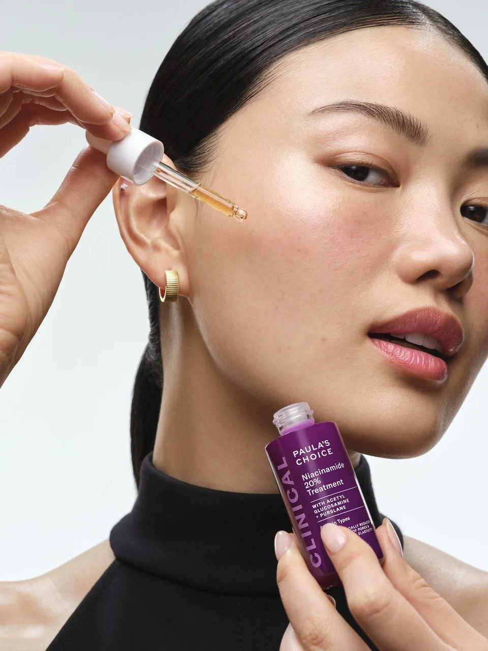
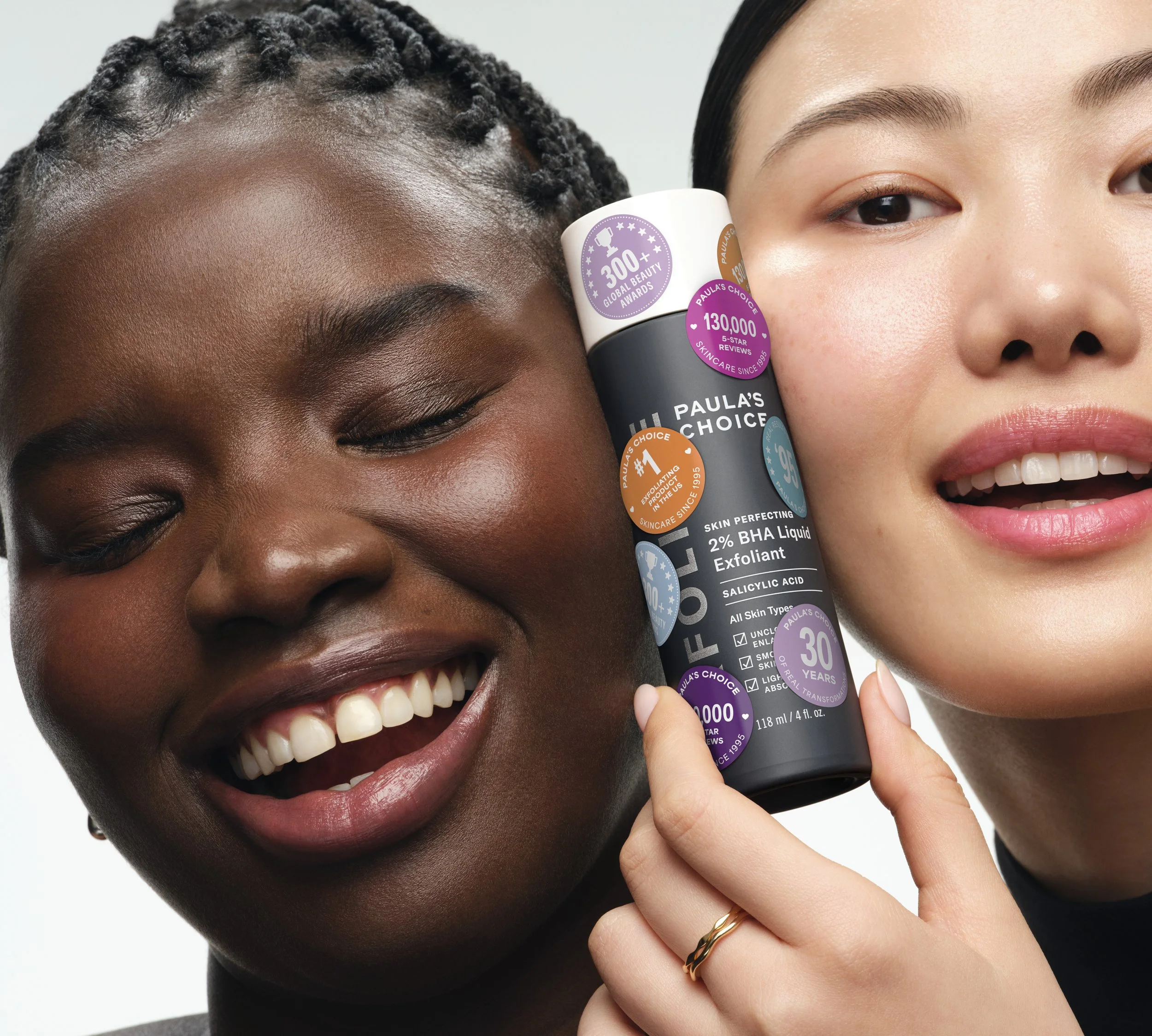
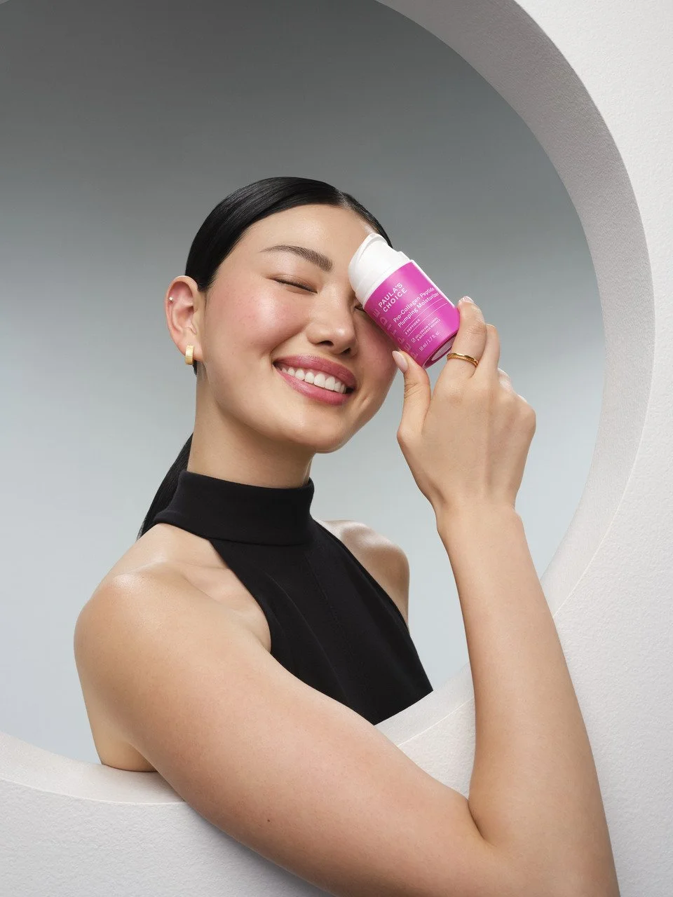
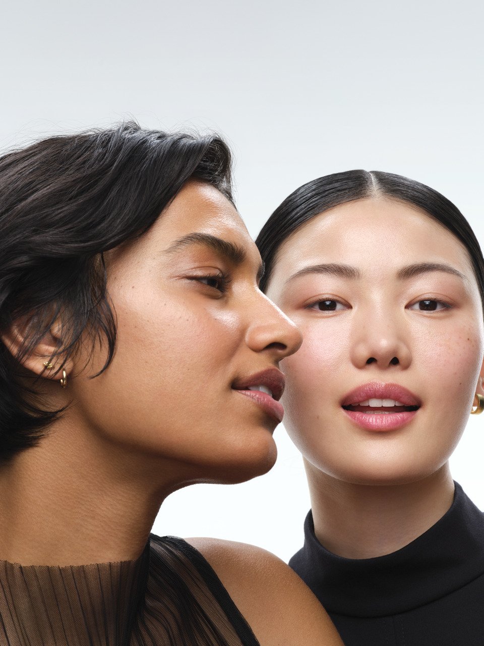
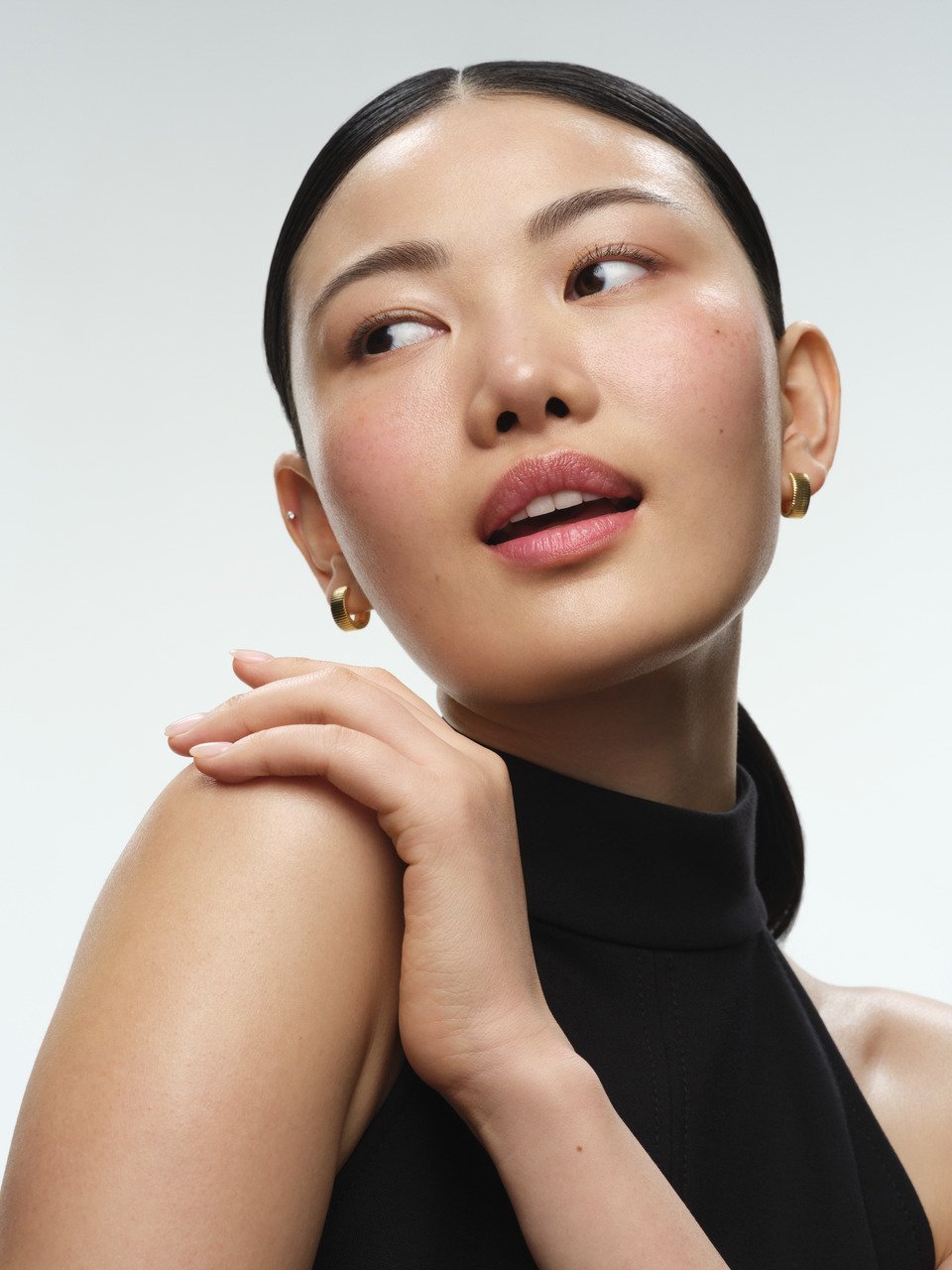
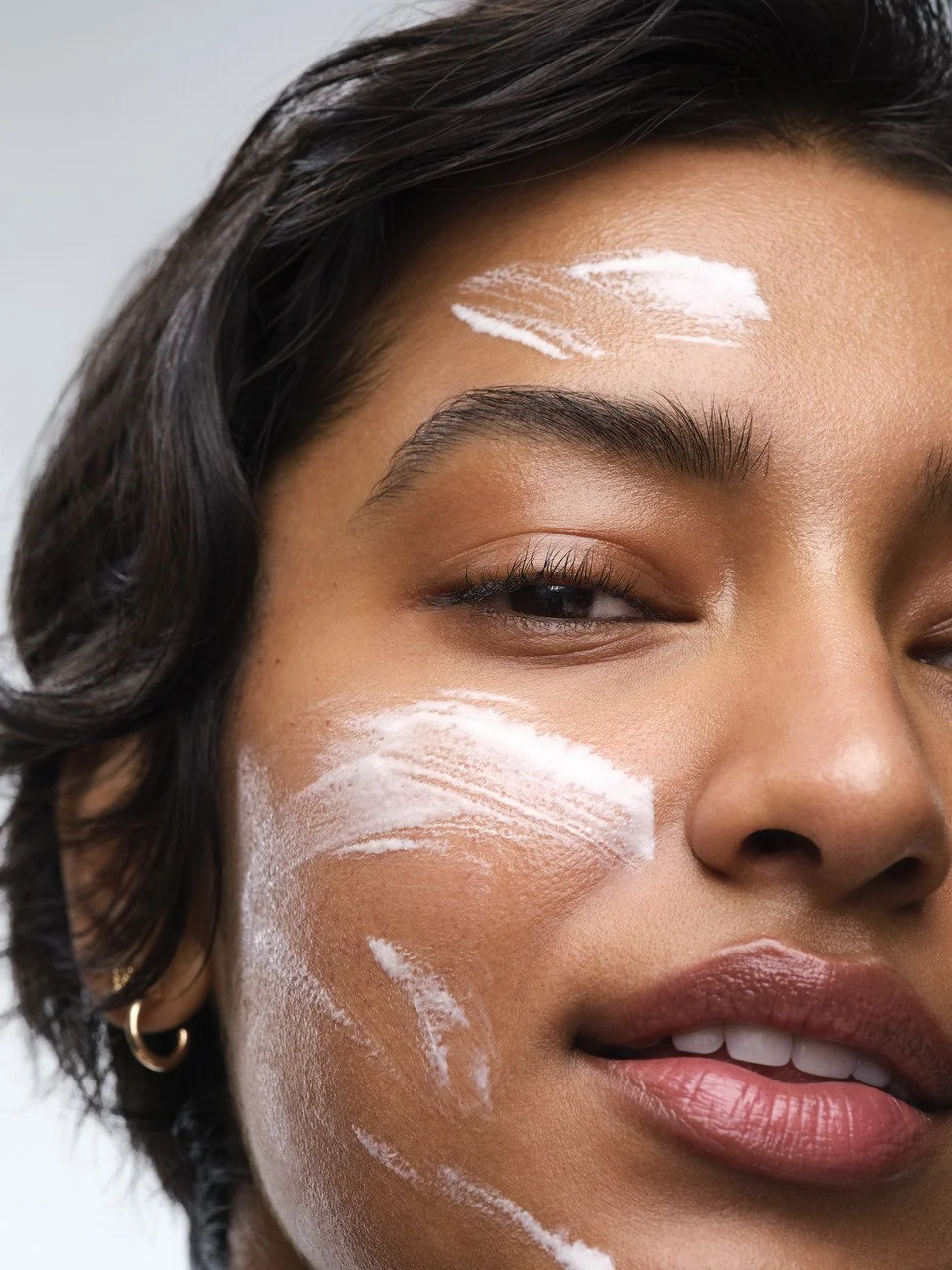
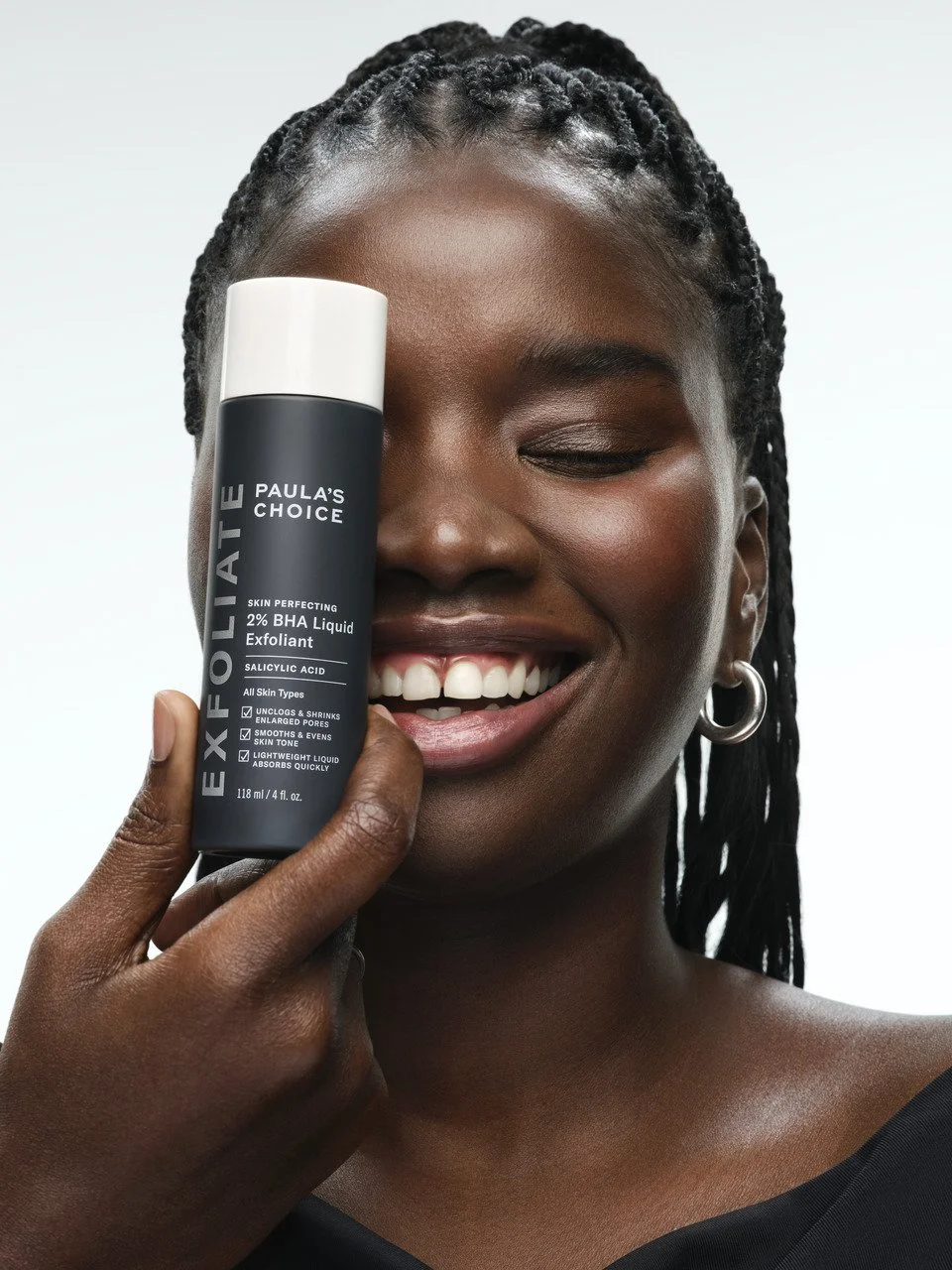
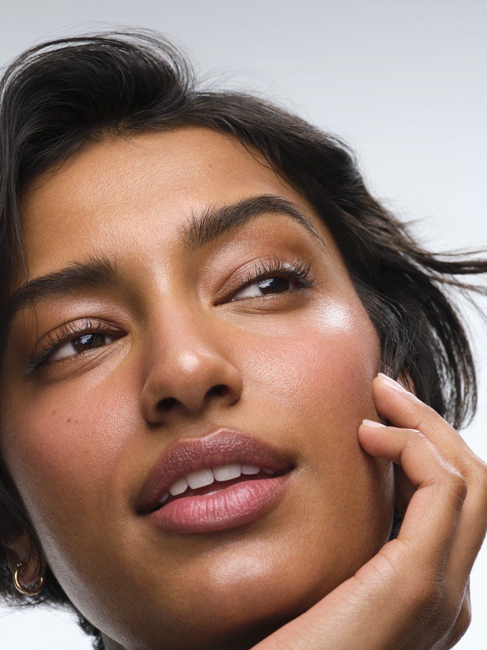
Art direction balances human truth with clinical clarity—showing both real skin and the efficacy behind it.
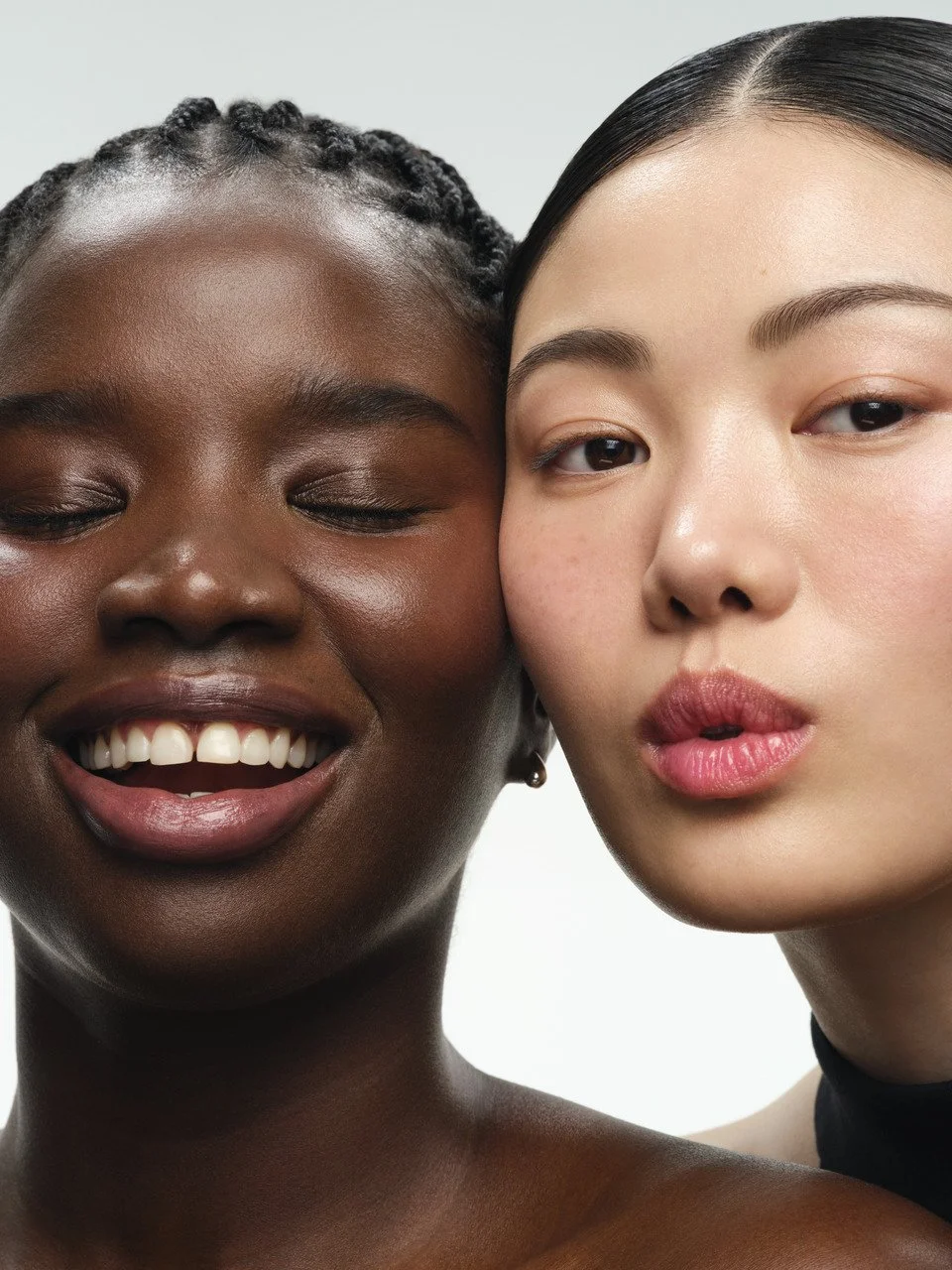
Model imagery celebrates authenticity and individuality, with minimal retouching and natural interaction with the product—bringing warmth and credibility.
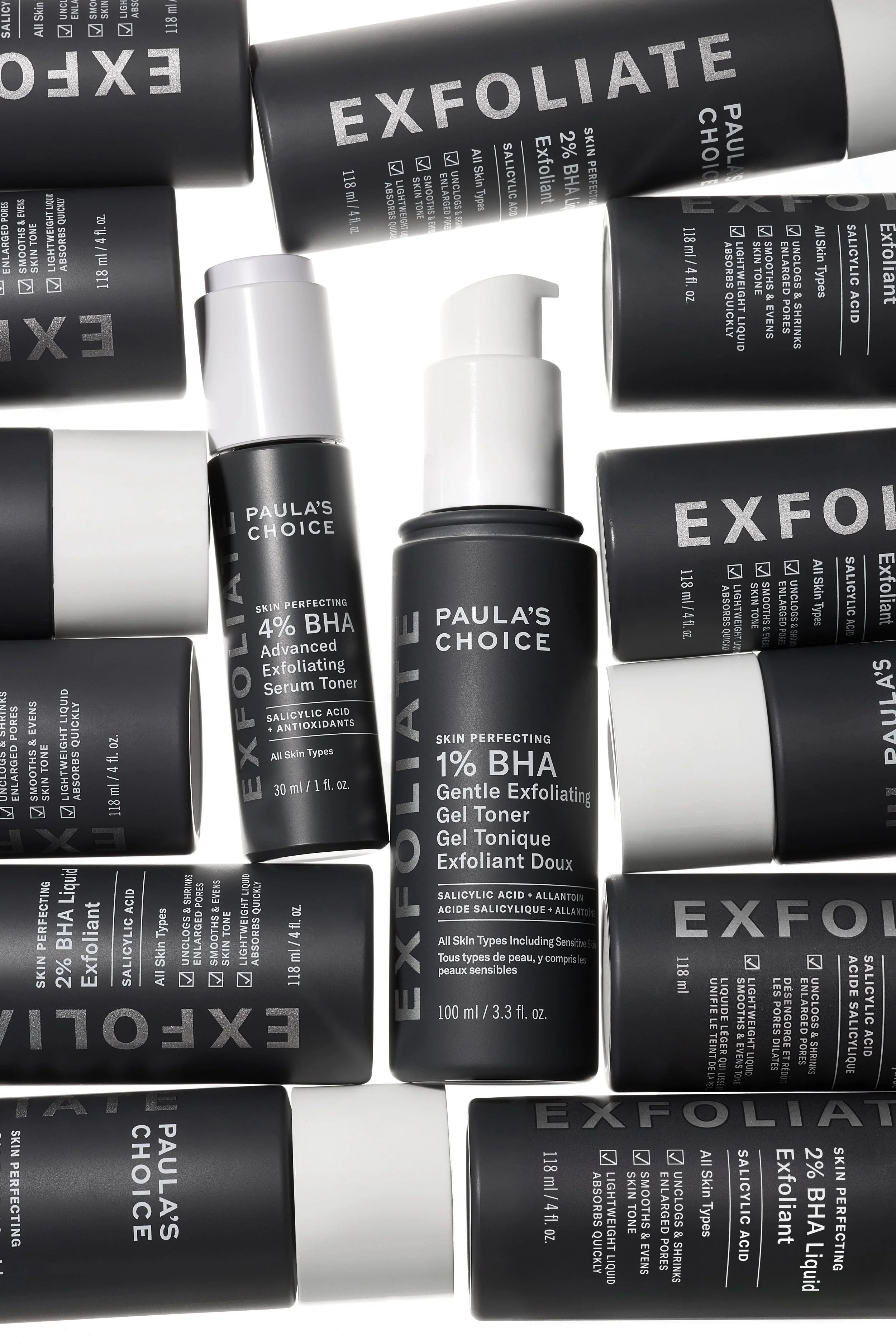
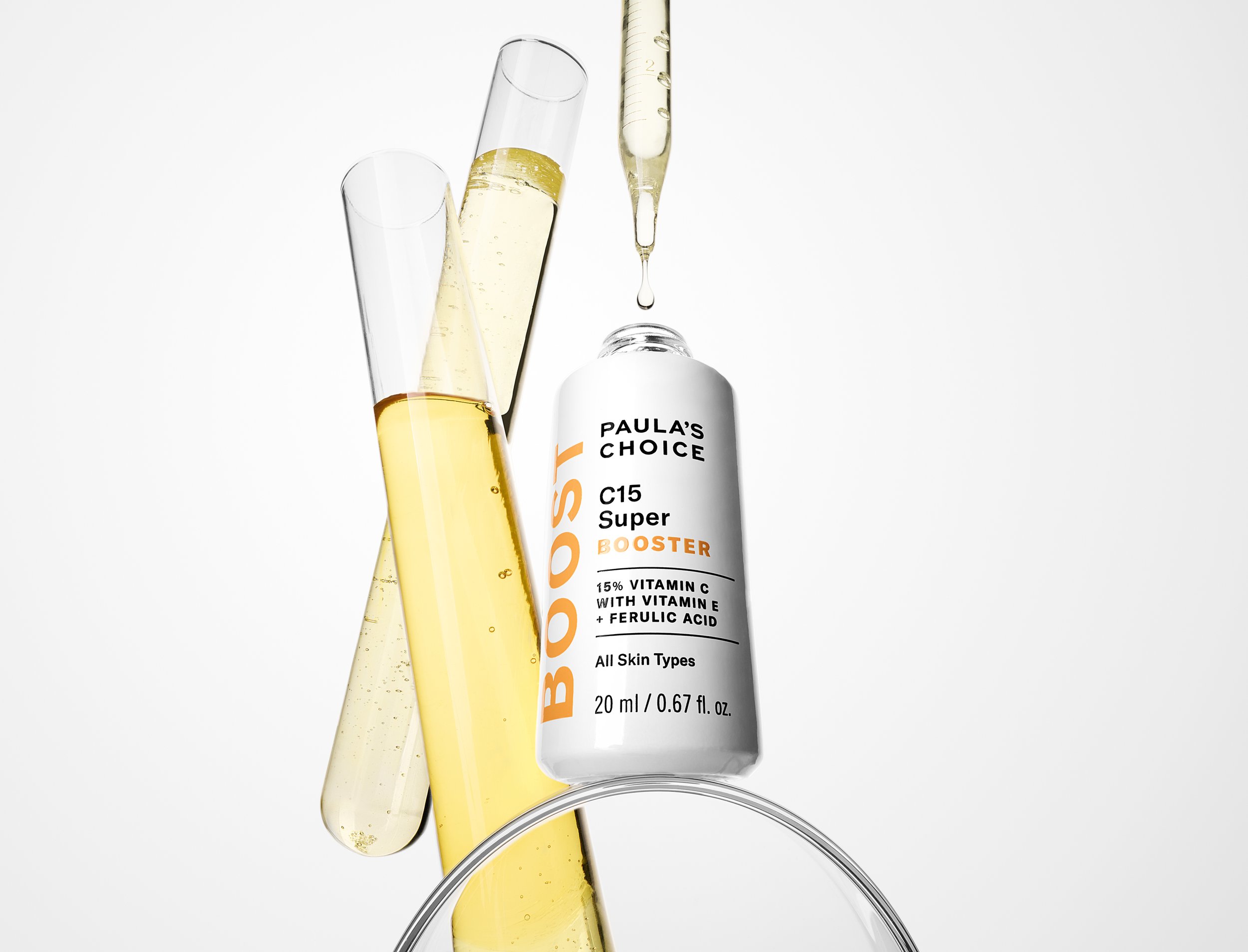
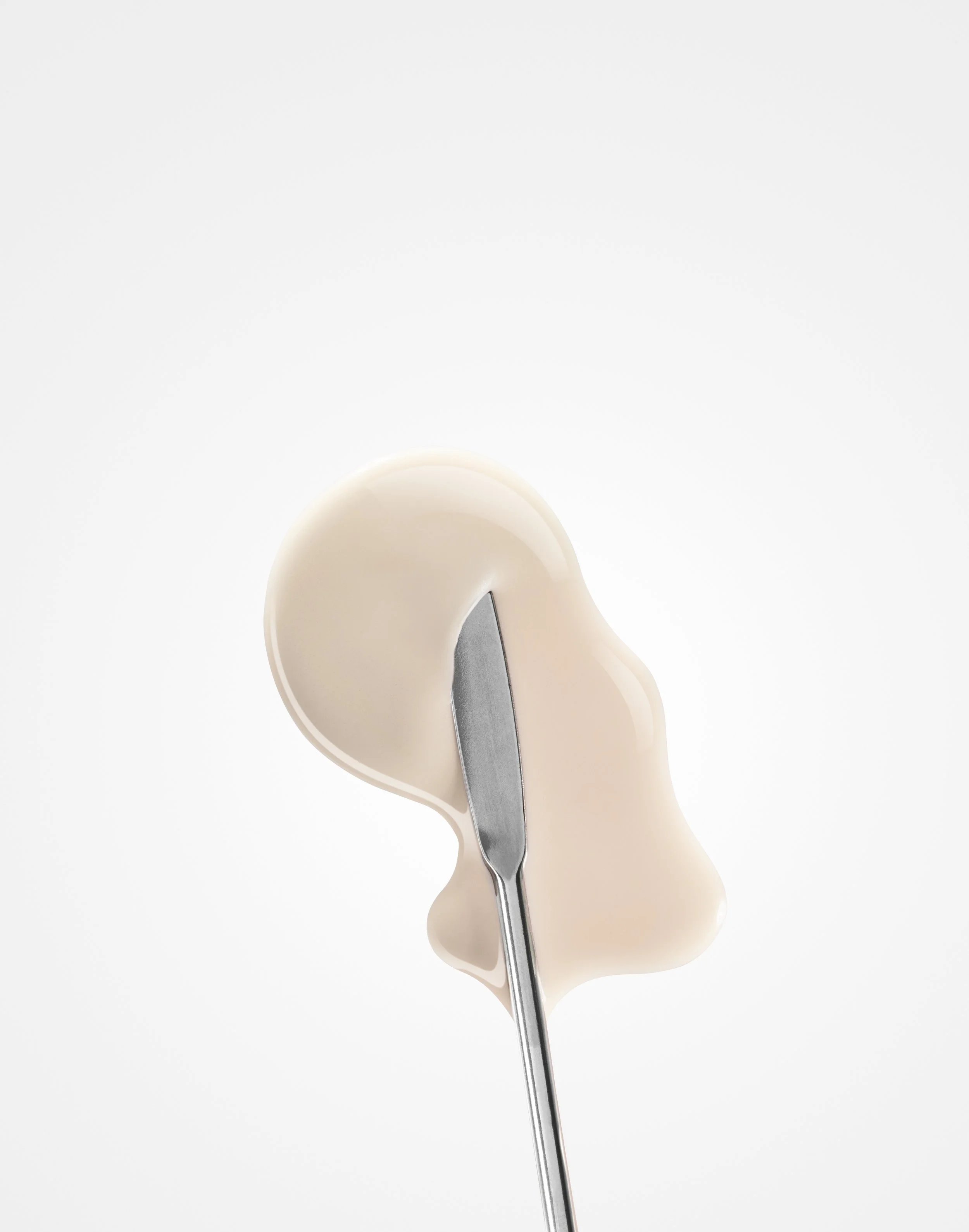
Product imagery draws from lab environments, using clean compositions, controlled lighting, and materials that signal precision and clinical clarity. Liquids, textures, and moments of interaction highlight benefits in a way that feels intuitive, not staged.
The result is a visual language where science is not just stated, but seen and understood.

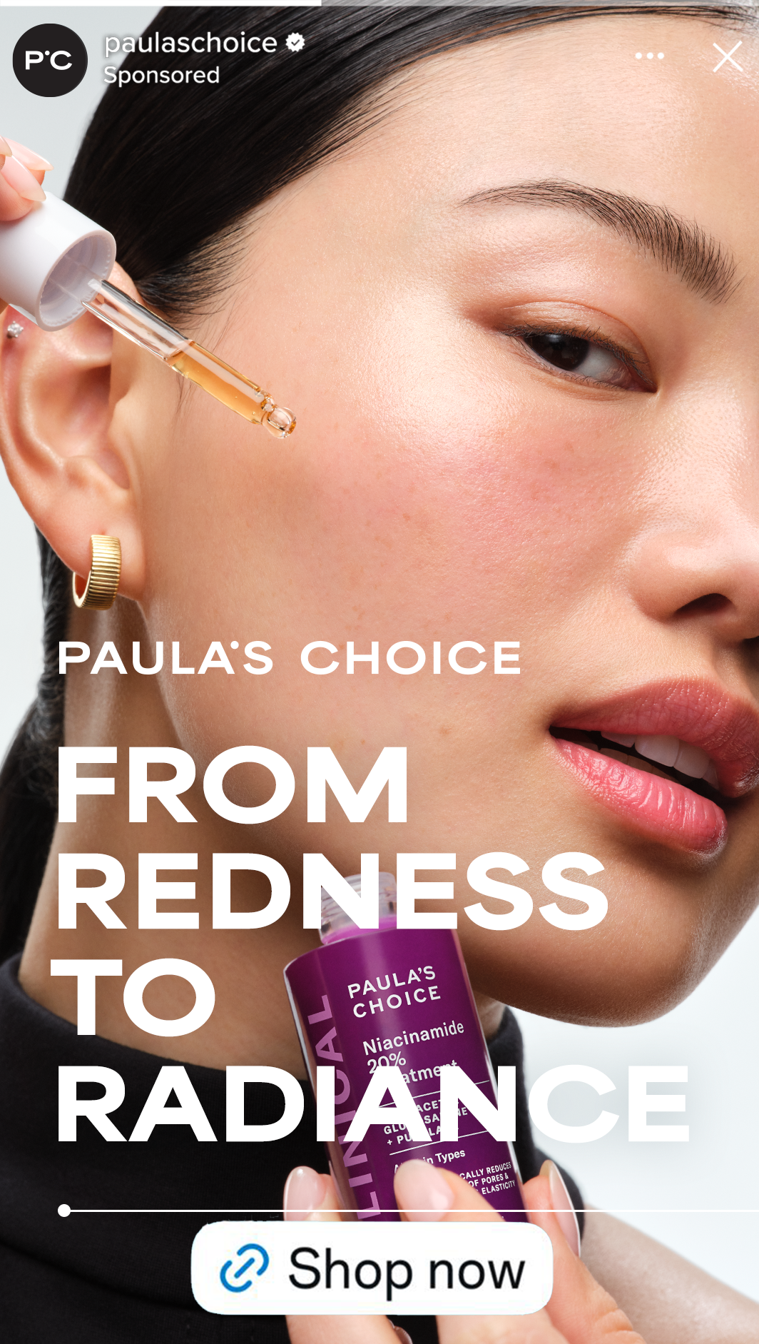
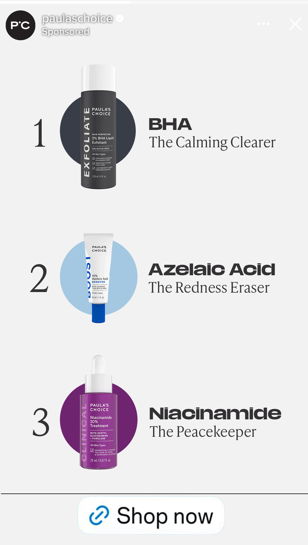
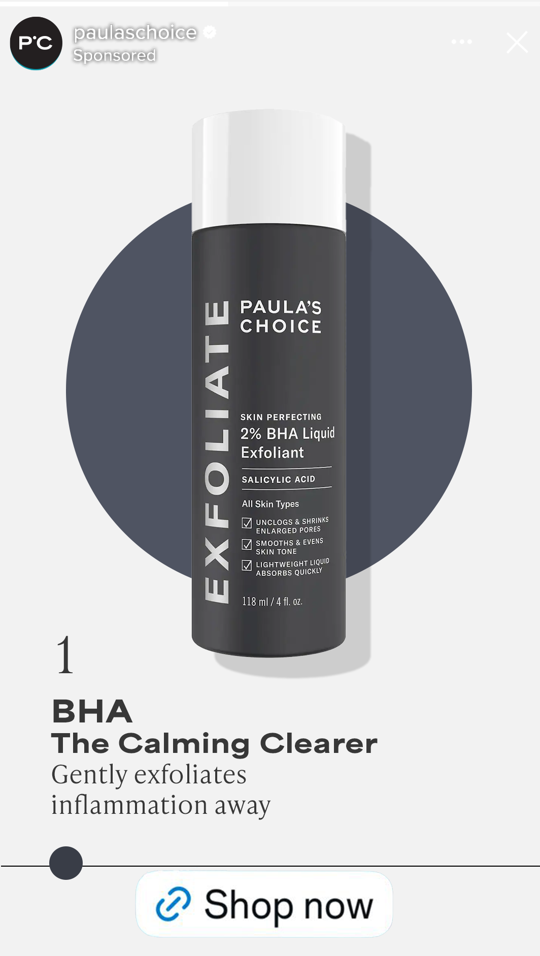
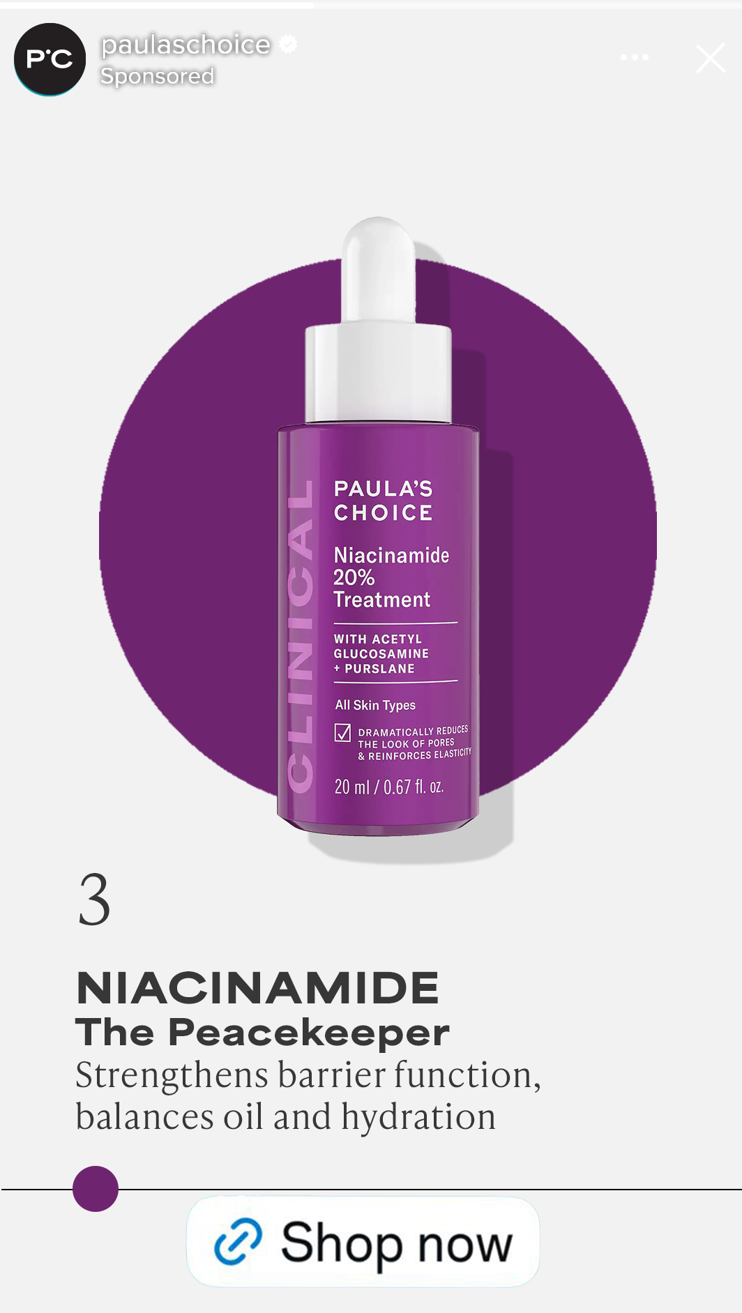
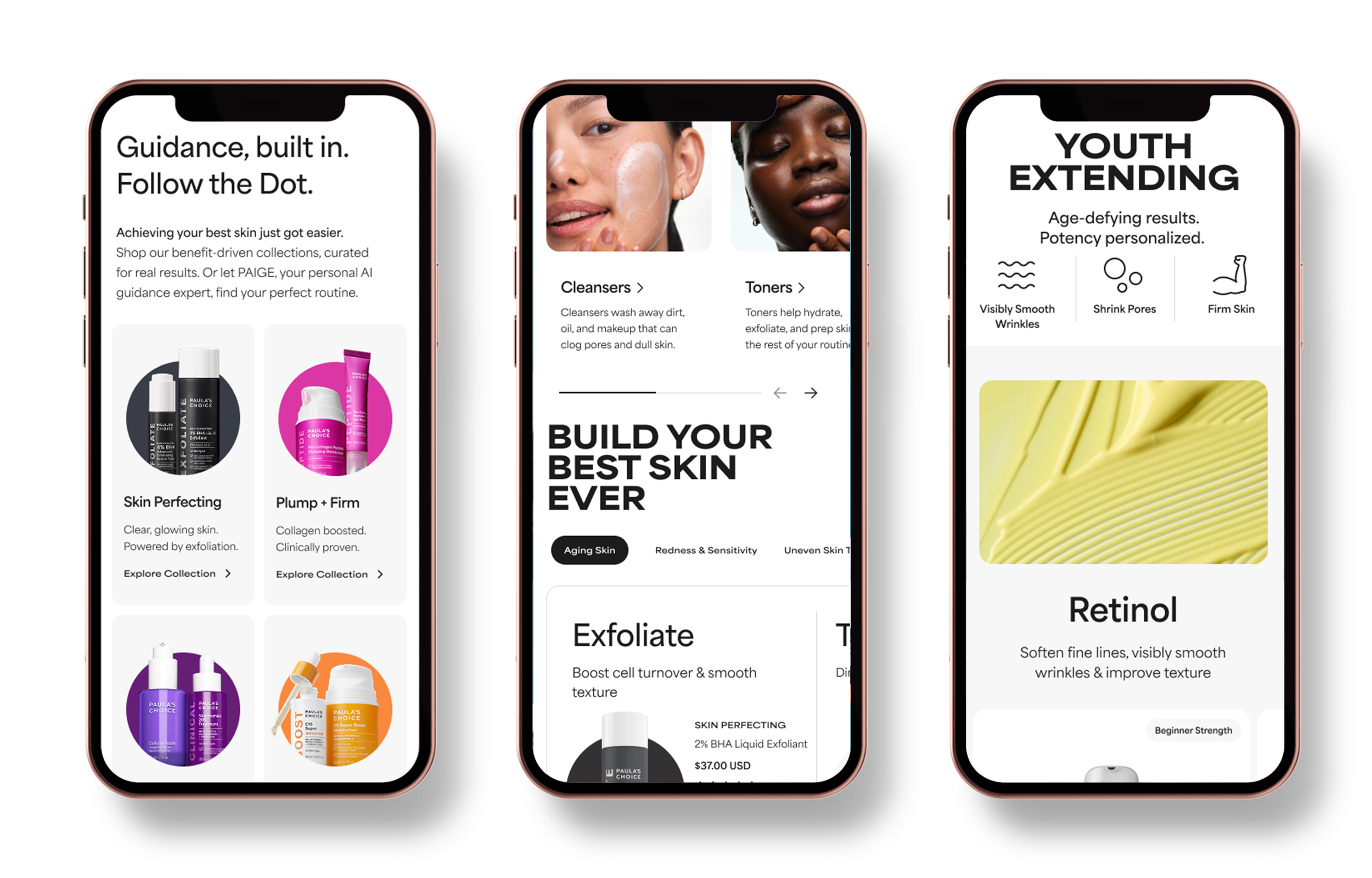
The digital experience translates the guidance system into action—mirroring how consumers naturally navigate Paula’s Choice across all touch points.
Content is organized around consumer needs, helping users identify concerns, understand benefits, and build routines with ease. The color dot system organizes products by franchise and primary benefit, supporting intuitive navigation and creating consistency across the digital experience.

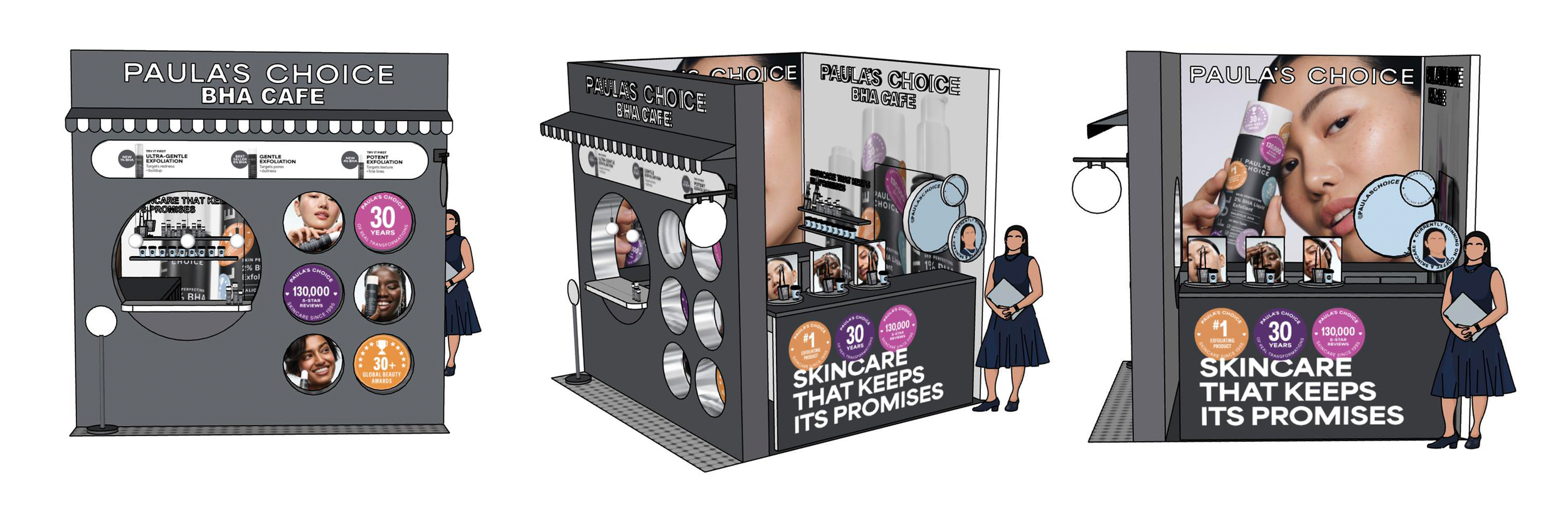
At Sephoria—a large-scale, immersive beauty event hosted by Sephora—the brand extends its system into a physical environment designed for discovery and engagement.
The booth functions as an extension of the brand’s guidance system—helping consumers navigate, learn, and choose with clarity in a high-energy retail setting. Scaling the dot system into spatial form, using scale, color, and repetition to guide movement and highlight key concerns and benefits. Interactive moments bring credentials to life—surfacing product education through motion and real-time engagement.